All elements provide templates for ease use. Hover over the element, you can see templates appearing on the side, select the template and draw on the canvas to directly use the template.
Chart Overview
Properties of chart elements might be different depending on different layouts.
| Chart Type | Data Type | Data Source | Max. Number of Data Source | Linkage |
|---|---|---|---|---|
| Dashboard | Number, real-time data | Object attribute and SQL data query | 1 | - |
| Gauge | 1 | - | ||
| Line Chart | Two-dimensional array (one of them must be number), history data or relational data | Numeric object attribute, service and form template and SQL data query | 20 | Links with input boxes, drop-down boxes, date controls, radios and checkboxes. |
| Spline Chart | 8 | |||
| Column | 8 | |||
| Area | 8 | |||
| Scatter | 8 | |||
| Histogram/Bar Chart | 1 | |||
| Spc Chart | 1 | |||
| ProgressBar | 8 | |||
| Funnel | 1 | |||
| Spider Chart | 8 | |||
| Pie | 2 | |||
| Annular Chart | 2 | |||
| Bubble | Three-dimensional array (two of them must be number), history data or relational data | Object attribute, service, form template and SQL data query | 8 | |
| XRange | Two-dimensional array (one of them must be number or date) | Service, form template and SQL data query | - | - |
Free Layout
This section introduces general properties of charts, and for special properties of each chart, refer to specific chapters.
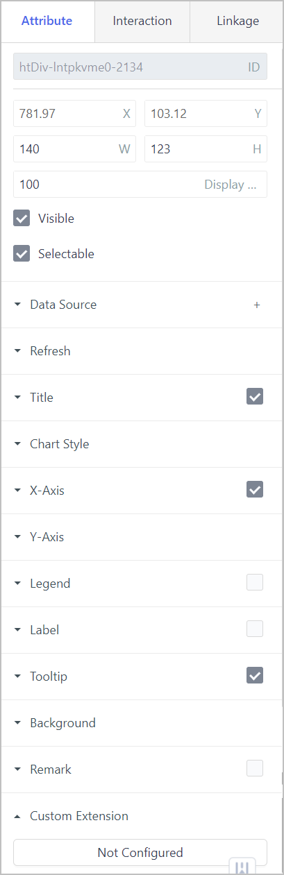
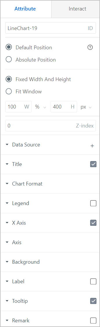
- Basic information
| Parameter | Description |
|---|---|
| ID | Automatically generated. Used as identifier in scripts. |
| X/Y | Center coordinate of the element. |
| W/H | Width and height of the element. |
| Display Level | The relative display level of the element on the canvas when overlapping. The larger the number, the more front the element is displayed. |
| Visible | Set whether the element is visible in operation center. |
| Selectable | Set whether the element can be selected. |
| Refresh | Enter a number to refresh the chart at the set interval. |
| Title | Set the visibility, name and style of the chart title and subtitle. |
| Chart Style | Different according to different types of charts. For details, see descriptions under each chart element. |
| Background |
|
| Remark | Set whether to display remarks at the lower-right corner of the chart and enter the content. |
| Custom Extension | Write custom script (HighChart available) to extend chart element functions. info Configuration validity priority: Interaction script > custom script > property panel. |
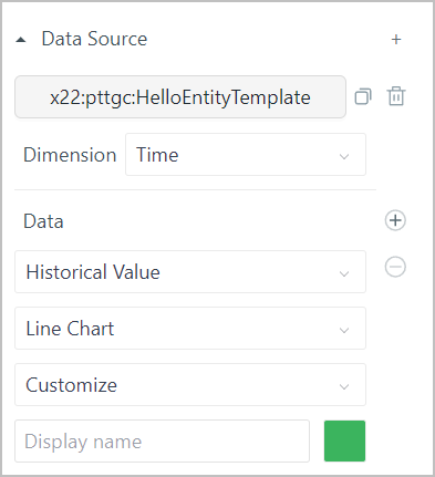
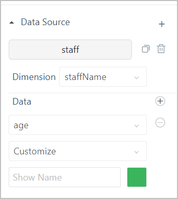
- Data source
| Parameter | Description |
|---|---|
| Select data source | Select chart data source from object template, instance attribute and SQL data query. info Click |
| Dimension | X axis data of the chart. info If the data source is an object service, make sure to set the return value type to JSON. Otherwise, X/Y axis data is not optional. |
| Data | Y axis data of the chart.
info Click |
 to add multiple data sources.
 to add more Y axis.
- X axis
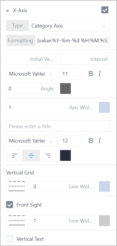
| Parameter | Description |
|---|---|
| Type |
|
| Initial Value | Set the initial display value of the X axis. For example, set it to 1, meaning the first value of X axis field will not be displayed. |
| Interval | Interval of X axis field display. For example, set it to 4, meaning every 4 data items, X axis field is displayed. |
| Style | Set the X axis display style, such as font family, size, weight, italic and italic angle. |
| Axis Width | X axis line width and color. |
| Title | X axis title and style. |
| Vertical Grid | Vertical grid on the chart and its style. |
| Front Sight | Set whether to display the front sight when mouse moves over a point. If enabled, you can set its style. |
| Vertical Text | Set whether to display scale values vertically. |
- Y axis
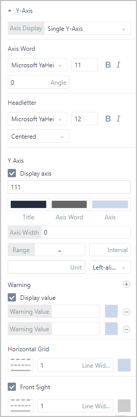
| Parameter | Description |
|---|---|
| Axis Display | Select the Y axis type from Single Axis and Multiple Axis. For Multiple Axis, each data source is independent and the range is self-adaptive based on all data sources. |
| Axis Word | Scale style, including font family, size, weight, italic and italic angle. |
| Headletter | Y axis title style, including font family, size, weight, italic and italic angle. |
| Y Axis |
|
| Warning | Enable warning value, and set multiple values and their colors for highlighted display. |
| Horizontal Grid | Horizontal grid on the chart and its style. |
| Front Sight | Set whether to display the front sight when mouse moves over a point. If enabled, you can set its style. |
- Legend
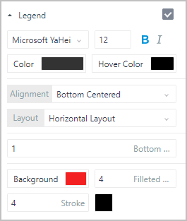
| Parameter | Description |
|---|---|
| Style | Legend style, including font family, size, weight, italic, color and color when hovered over. |
| Alignment/Layout | Legend alignment and position relative to the chart. |
| Bottom margin of legend entry | Distance between legend and the bottom of the chart. |
| Background/Filleted Corner/Stroke | Color, filleted corner size and stroke style of legend background. |
- Label
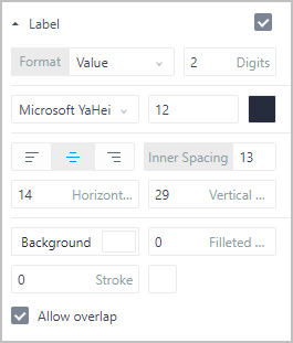
| Parameter | Description |
|---|---|
| Format | Label content, and when the label contains number, you can set the decimal digits. |
| Style | Label font family, size, color and alignment relative to the data point. |
| Inner Spacing | Distance between the label and corresponding data point. |
| Horizontal/Vertical Offset | Horizontal and vertical offset between the label and corresponding data point. |
| Background/Filleted Corner/Stroke | Color, filleted corner size and stroke style of legend background. |
| Allow overlap | Whether to allow labels to overlap. |
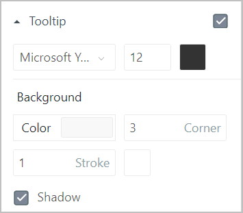
- Tooltip: Displays data source information when mouse hovers over the element.
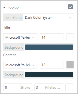
| Parameter | Description |
|---|---|
| Formatting | Tooltip display style. When setting it to Custom, you can set the tooltip style. |
| Title | Tooltip title style, including font family, size, color and background color. |
| Content | Tooltip content style, including font family, size and color, tooltip background color, filleted corner size, stroke color and width. |
Interaction: Set interaction events. For details, see Interaction.
Linkage: Link the data source with other elements to achieve linkage effect. For details, see Data Linkage in Free Layout.
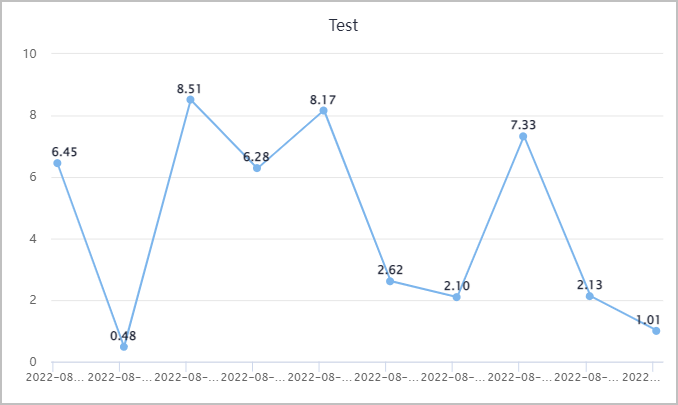
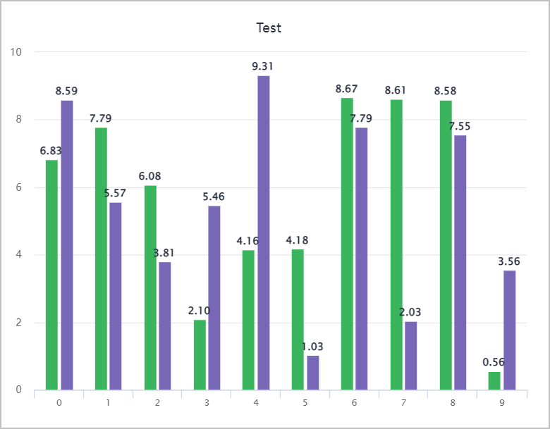
Line Chart
Line charts are often used to display continuous data changes along time. Applicable for viewing data changing trends.
Spline chart is similar to line chart. Spline chart supports lateral display.
- Drill-down column: When the data source is relational data, you can add a drill-down column field, and then by clicking a data point on the chart, more detailed data is displayed.
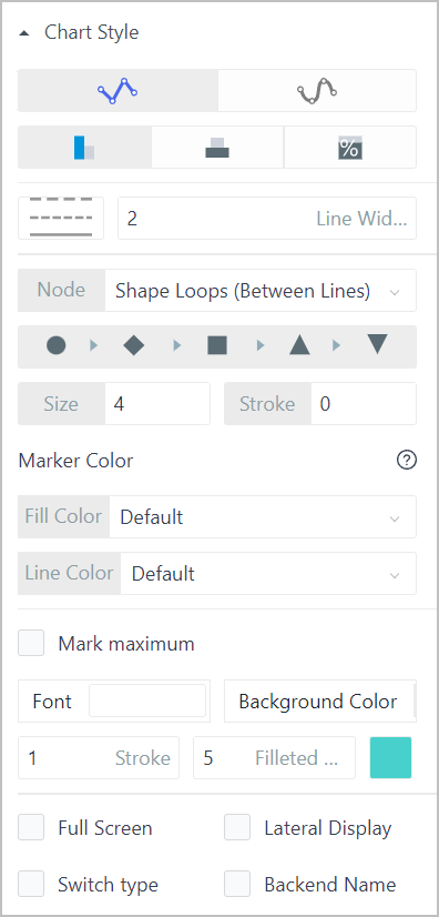
- Chart Style
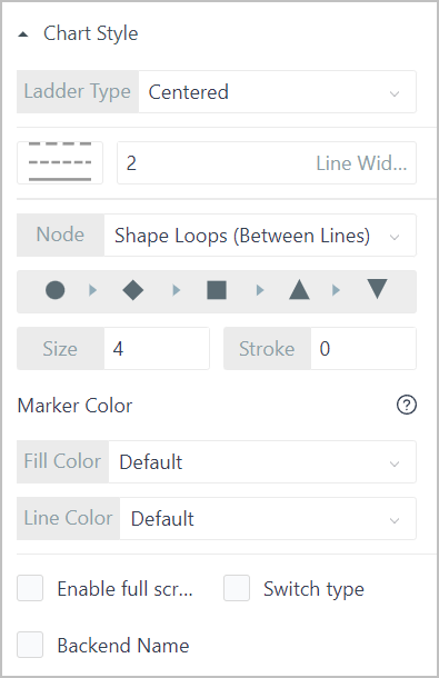
| Parameter | Description |
|---|---|
| Ladder Type | Ladder formed from data points and lines between points. Select the relative position of data points on the connection line. Null means direct connection between points. |
| Line style | Connection line type and width. |
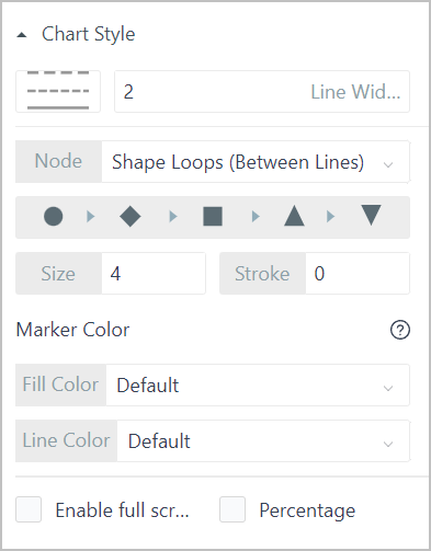
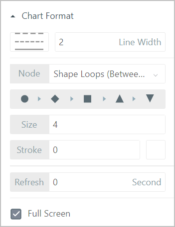
| Node | Node type, size and stroke width.
|
| Marker Color | Node color and node border color. |
| Enable full screen | Whether to display the full screen icon at the upper-right corner to enable full screen in operation center. |
| Switch type | Whether to display the chart type switching drop-down box at the upper-right corner to enable type switching in operation center. |
| Backend Name | Whether to allow user to use the returnewd value as the data name (fixed parameter: trailingShowName). |
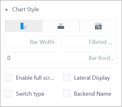
Column
Often used to compare values at different times or under different conditions.
| Parameter | Description |
|---|---|
| Column Type | How columns are displayed on the canvas based on the selected data source. |
| Column Style | Column width, filleted corner and column border width. |
| Enable full screen | Whether to display the full screen icon at the upper-right corner to enable full screen in operation center. |
| Lateral Display | Switch the columns display direction between lateral and vertical. |
| Switch type | Whether to display the chart type switching drop-down box at the upper-right corner to enable type switching in operation center. |
| Backend Name | Whether to allow user to use the returnewd value as the data name (fixed parameter: trailingShowName). |
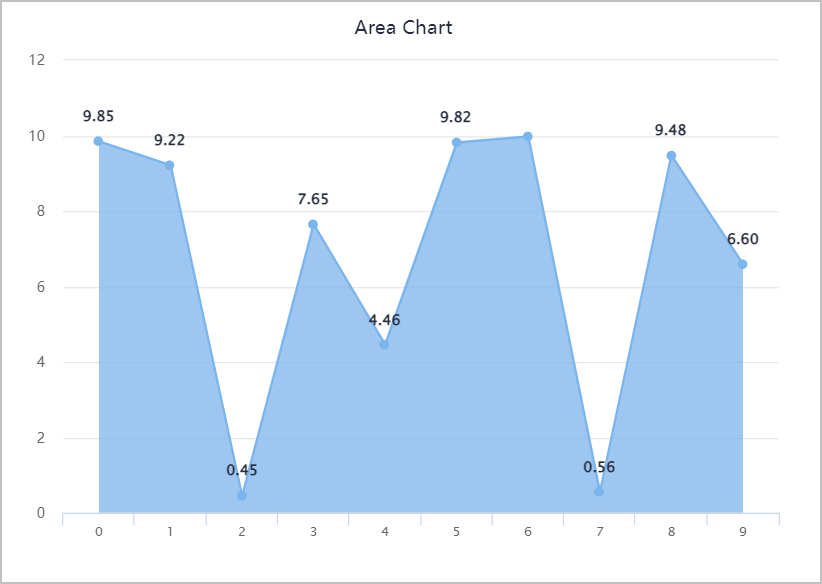
Area
Emphasizes the extent to which the data changes during a period.
| Parameter | Description |
|---|---|
| Area Type | How area is displayed on the canvas based on the selected data source. |
| Area Style | Area line type and width. |
| Node | Node type, size and stroke width.
|
| Marker Color | Node color and node border color. |
| Mark Maximum | Whether to display the maximum value, and the value display style. |
| Enable full screen | Whether to display the full screen icon at the upper-right corner to enable full screen in operation center. |
| Lateral Display | Switch the columns display direction between lateral and vertical. |
| Switch type | Whether to display the chart type switching drop-down box at the upper-right corner to enable type switching in operation center. |
| Backend Name | Whether to allow user to use the returnewd value as the data name (fixed parameter: trailingShowName). |
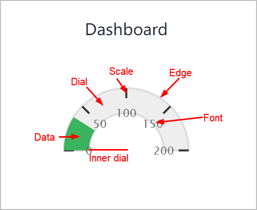
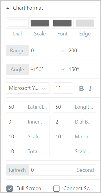
Dashboard
Dashboard binds with numeric real-time data.
| Parameter | Description |
|---|---|
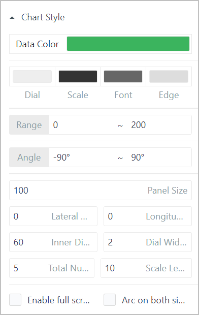
| Data Color | Data color displayed on the dashboard. |
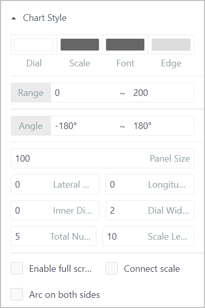
| Style | Colors of the dashboard dial, scale, value font and edge. |
| Range | Range of the dashboard. |
| Angle | Start and end angle of the dashboard. When they add up to 360°, a circle is formed. |
| Panel Size | Dashoboard size. |
| Lateral/Longitudinal Offset | Dashboard position horizontally and vertically. |
| Inner Dial | Radius of the dashboard inner edge. |
| Dial Width | Width of the dashboard edge. |
| Total Number of Scales | The number of scales on the dashboard. |
| Scale Length | Length of the scale lines. |
| Enable full screen | Whether to display the full screen icon at the upper-right corner to enable full screen in operation center. |
| Arc on both sides | Whether to display the edge of the data part as arc. |
Guage
Guage binds with numeric real-time data.
- Chart Style
| Parameter | Description |
|---|---|
| Style | Colors of the guage dial, scale, value font and edge. |
| Range | Range of the guage. |
| Angle | Start and end angle of the guage. When they add up to 360° (neither can exceed 180), a circle is formed. |
| Panel Size | Guage size. |
| Lateral/Longitudinal Offset | Guage position horizontally and vertically. |
| Inner Dial | Radius of the guage inner edge. |
| Dial Width | Width of the guage edge. |
| Total Number of Scales | The number of scales on the guage. |
| Scale Length | Length of the scale lines. |
| Enable full screen | Whether to display the full screen icon at the upper-right corner to enable full screen in operation center. |
| Connect scale | Set whether to connect the start and end of the guage border. |
| Arc on both sides | Whether to display the edge of the data part as arc. |
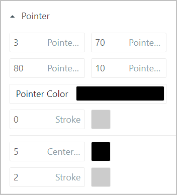
- Pointer
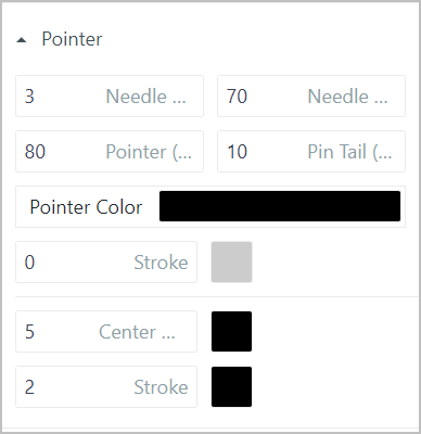
| Parameter | Description |
|---|---|
| Needle Width | Pointer width. |
| Needle Tip | Width of the pointer tip. |
| Pointer | Pointer length. |
| Pin Tail | Length of the pointer tail. |
| Pointer Color | Pointer color. |
| Stroke | Width and color of the pointer border. |
| Center Diameter | Diameter and color of the pointer pivot. |
| Stroke | Width and color of the pointer pivot border. |
- Custom Axis
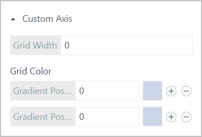
| Parameter | Description |
|---|---|
| Grid Width | Axis width. |
| Grid Color | Add multiple color sections to the axis and set specific positions (0-1). For example, add a red section and set its position to 0.5, the top and bottom of the axis will be red (0 means left and 1 means right). |
- Identification Area
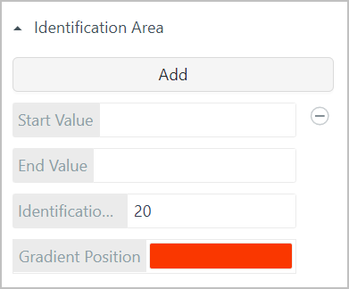
| Parameter | Description |
|---|---|
| Start/End Value | The start and end value of the identification area on the axis. |
| Identification Area Width | Area width on the axis. |
| Gradient Position | Area color. Gradual color change is available. |
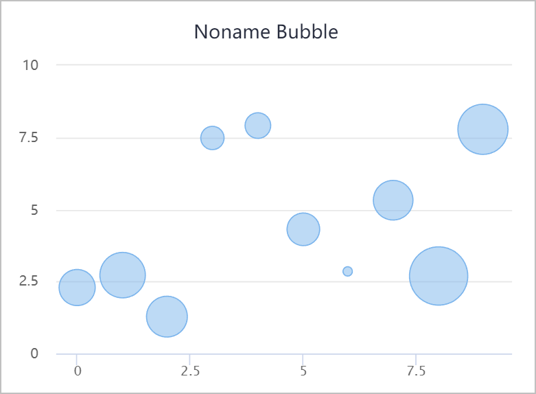
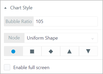
Bubble
Displays data distribution.
| Parameter | Description |
|---|---|
| Bubble ratio | Display size of bubbles. |
| Node | Node type, size and stroke width.
|
| Enable full screen | Whether to display the full screen icon at the upper-right corner to enable full screen in operation center. |
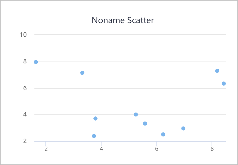
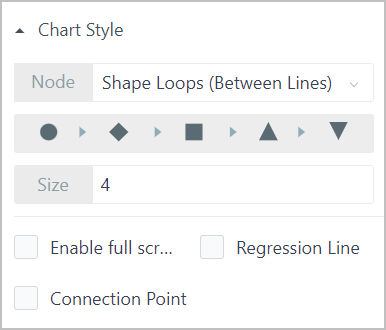
Scatter
Displays data distribution.
| Parameter | Description |
|---|---|
| Node | Node type, size and stroke width.
|
| Size | Scattered point size. |
| Enable full screen | Whether to display the full screen icon at the upper-right corner to enable full screen in operation center. |
| Regression Line | Whether to display the fitted regression line between scattered data points. |
| Connection Point | Whether to connect all the data points. |
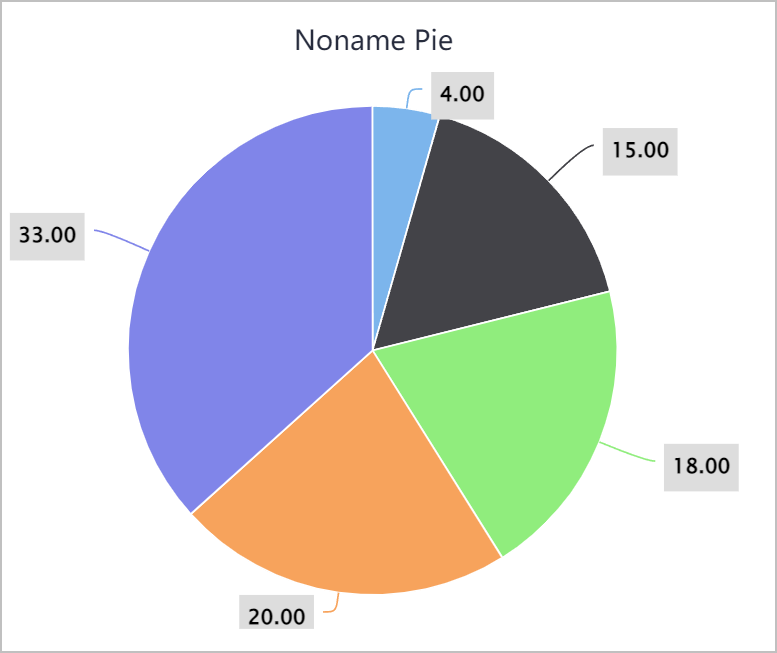
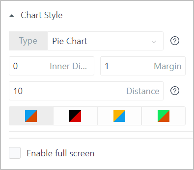
Pie
Displays the ratio between each section of data and the whole.
| Parameter | Description |
|---|---|
| Type | Select between normal pie chart and pie chart with different section radius based on the data source. |
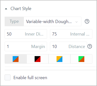
| Inner Diameter | Set the radius of the inner circle around the origin. |
| Margin | Distance between pie sections. |
| Distance | Set the distance between the pie chart and the chart area border. |
| Color | Color scheme of the pie chart. |
| Enable full screen | Whether to display the full screen icon at the upper-right corner to enable full screen in operation center. |
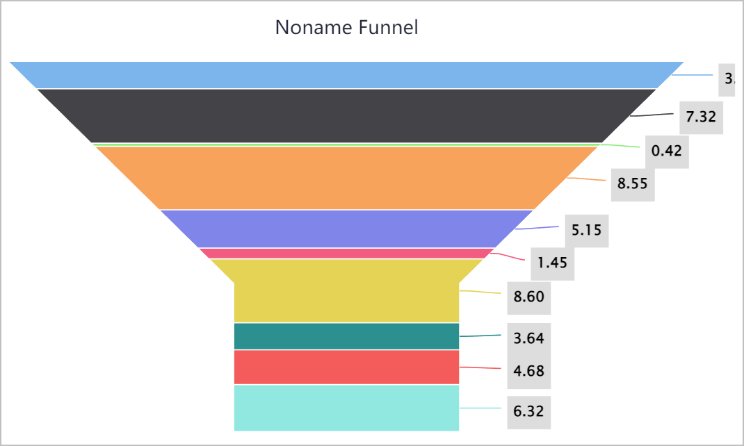
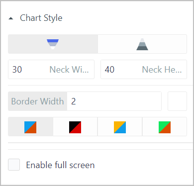
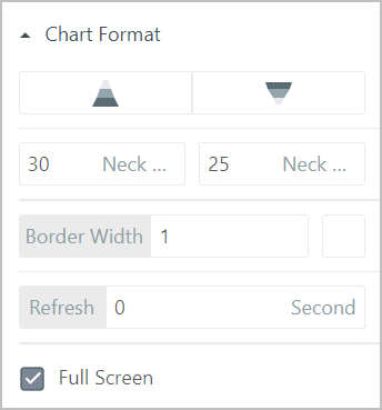
Funnel
Often used to display the data decreasing. Funnel chart automatically sorts the data, and for different sorting sequence, you can convert the funnel chart to a pyramid.
| Parameter | Description |
|---|---|
| Type | Select between funnel chart and pyramid. |
| Neck Width/Height | The width and height of the funnel neck part. |
| Border Width | Set the border width and color of the funnel chart. |
| Color | Color scheme of the pie chart. |
| Enable full screen | Whether to display the full screen icon at the upper-right corner to enable full screen in operation center. |
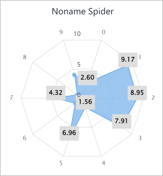
Spider Chart
Mainly used to evaluate each index of a data set. X axis represents index variables and Y axis stands for the distance between the origin to each data point, which indicates the evaluation of each index.
- Data Source
| Parameter | Description |
|---|---|
| Line Color | Section border line color of the spider chart. |
| Area Color | Section color of the spider chart. |
- Chart Style
| Parameter | Description |
|---|---|
| Line Style | Line type and width. |
| Node | Node type, size and stroke width.
|
| Marker Color | Node color and node border color. |
| Enable full screen | Whether to display the full screen icon at the upper-right corner to enable full screen in operation center. |
| Percentage | Whether to display the data of each section in percentage. |
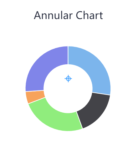
Annular Chart
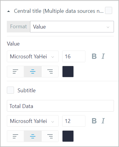
- Central Title: Unavailable for multiple data sources.
| Parameter | Description |
|---|---|
| Format | Select title displayed in the center of the annular chart between value and name. |
| Style | Title style, including font family, size, weight, italic, alignment and color. |
| Subtitle | Whether to display subtitle displayed in the center of the annular chart under Title. |
| Subtitle style | Subtitle style, including font family, size, weight, italic, alignment and color. |
- Chart Style
| Parameter | Description |
|---|---|
| Type | Select between normal annular chart and pie chart with different section radius based on the data source. |
| Inner Diameter | Set the radius of the inner circle around the origin. |
| Internal Ratio | |
| Margin | Distance between pie sections. |
| Distance | Set the distance between the annular chart and the chart area border. |
| Color | Color scheme of the annular chart. |
| Enable full screen | Whether to display the full screen icon at the upper-right corner to enable full screen in operation center. |
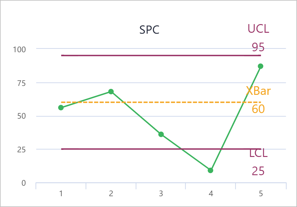
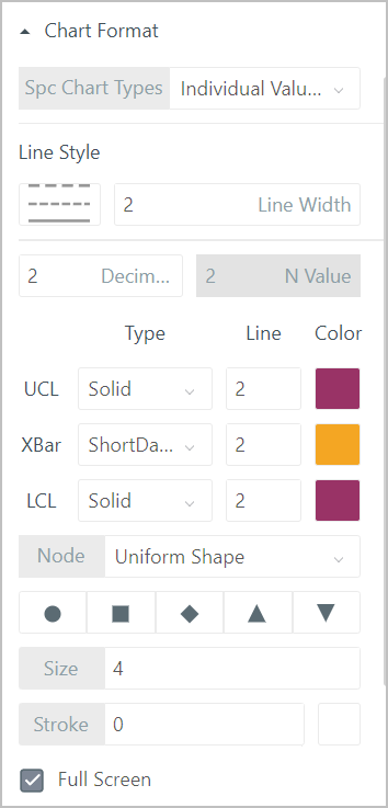
Spc Diagram
Analyzes and judges whether the procedure is stable. The spc diagram has uppr and lower limits.
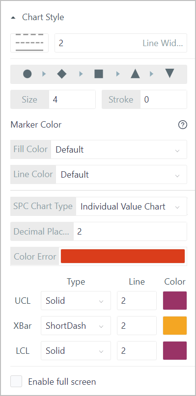
| Parameter | Description |
|---|---|
| Line Style | Line type and width. |
| Node | Node type, size and stroke width. |
| Marker Color | Node color and node border color. |
| SPC Chart Type |
|
| Decimal Places | Secimal places of the data. |
| Color Error | Color of abnormal data. |
| Specific Line Style | Set the style for each specific line, including line type, width and color. |
| Enable full screen | Whether to display the full screen icon at the upper-right corner to enable full screen in operation center. |
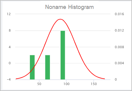
Bar Chart
Accurately displays data distribution. You can distribute data to multiple sections, and integrate data distribution in each section.
| Parameter | Description |
|---|---|
| Enable full screen | Whether to display the full screen icon at the upper-right corner to enable full screen in operation center. |
| Fitted Line | Set whether to display the fitted line (normal distribution line). |
Progress Bar
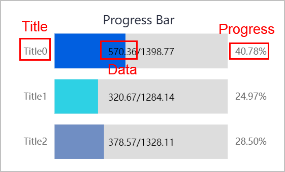
| Parameter | Description |
|---|---|
| Style | Progress bar type.
|
| Data Layout | The way to display related information on progress bar, including title, data and progress. |
| Chart Style | Set the background color of the progress bar. |
| Data Header | Title style of the progress bar. |
| Progress Value | Progress style of the progress bar. You can also set it to be displayed inside each bar. |
| Display Data | Style of current and total data of each bar. |
Xrange
Gantt chart tracks tasks and corresponding schedules.
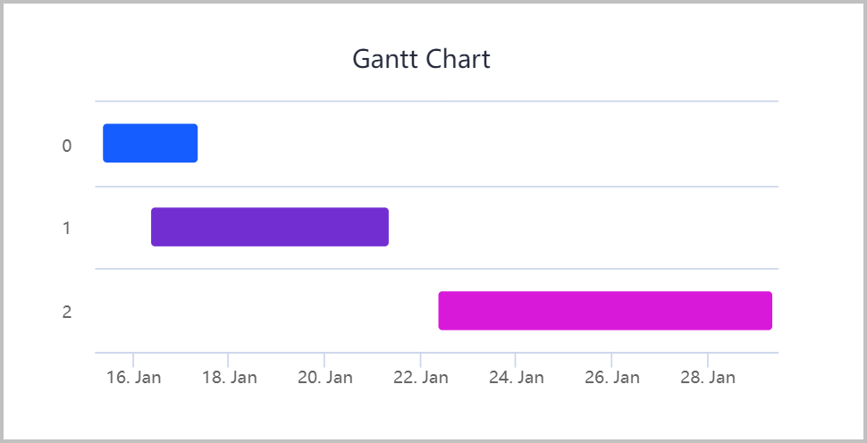
| Parameter | Description |
|---|---|
| Data Source |
|
| Chart Style |
|
| X Axis |
|
Grid Layout
This section introduces general properties of charts, and for special properties of each chart, refer to specific chapters.
- Basic information
| Parameter | Description |
|---|---|
| ID | Automatically generated and can be changed. Used as identifier in scripts. |
| Position |
|
| Size |
|
| W/H | Width and height of the element. The unit can be percentage or pixel. |
| Z-index | The relative display level of the element on the canvas when overlapping. The larger the number, the more front the element is displayed. |
| Title | Set the visibility, name and style of the chart title and subtitle. |
| Chart Format | Different according to different types of charts. For details, see descriptions under each chart element. |
| Background |
|
| Remark | Set whether to display remarks at the lower-right corner of the chart and enter the content. |
- Data source
| Parameter | Description |
|---|---|
| Select Data Source | Select chart data source from object template, instance attribute and SQL data query. info Click |
| Dimension | X axis data of the chart. info If the data source is an object service, make sure to set the return value type to JSON. Otherwise, X/Y axis data is not optional. |
| Data | Y axis data of the chart.
info Click |
- Legend
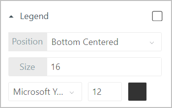
| Parameter | Description |
|---|---|
| Position | Legend position relative to the chart. |
| Size | Legend size, including legend icon and text. |
| Style | Legend style, including font family, size and color. |
- X axis
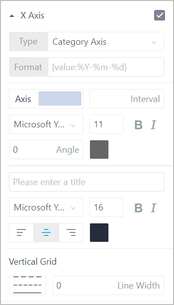
| Parameter | Description |
|---|---|
| Type |
|
| Axis | Line color of the X axis. |
| Interval | Interval of X axis field display. For example, set it to 4, meaning every 4 data items, X axis field is displayed. |
| Style | Set the X axis display style, such as font family, size, weight, italic and italic angle. |
| Title | X axis title and style. |
| Vertical Grid | Vertical grid on the chart and its type and width. |
| Vertical Text | Set whether to display scale values vertically. |
- Y axis
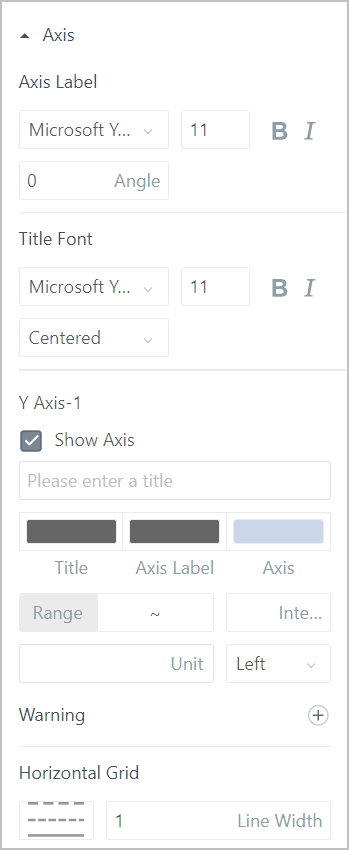
| Parameter | Description |
|---|---|
| Axis Label | Scale style, including font family, size, weight, italic and italic angle. |
| Title Font | Y axis title style, including font family, size, weight, italic and italic angle. |
| Y Axis-1 |
|
| Warning | Enable warning value, and set multiple values and their colors for highlighted display. |
| Horizontal Grid | Horizontal grid on the chart and its style. |
- Label
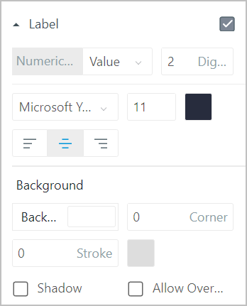
| Parameter | Description |
|---|---|
| Numerical Value | Label content, and when the label contains number, you can set the decimal digits. |
| Style | Label font family, size, color and alignment relative to the data point. |
| Background | Color, filleted corner size and stroke style of label background. |
| Shadow | Whether to add shadow to the label background. |
| Allow overlap | Whether to allow labels to overlap. |
- Tooltip: Displays data source information when mouse hovers over the element.
| Parameter | Description |
|---|---|
| Style | Tooltip display style. |
| Background | Color, filleted corner size and stroke style of tooltip background. |
| Shadow | Whether to add shadow to the tooltip background. |
- Interact: Set interaction events. For details, see Interaction.
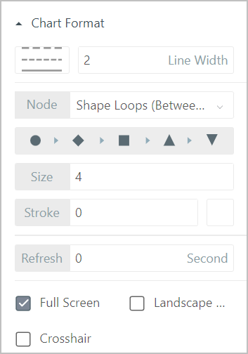
Line Chart
Line charts are often used to display continuous data changes along time. Applicable for viewing data changing trends.
Spline chart, area chart are similar to line chart.
| Parameter | Description |
|---|---|
| Line style | Connection line type and width. |
| Node | Node type, size and stroke width.
|
| Refresh | Refresh interval of the chart. |
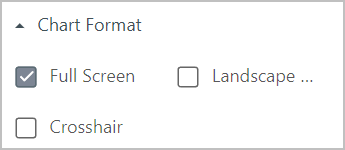
| Full Screen | Whether to display the full screen icon at the upper-right corner to enable full screen in operation center. |
| Landscape Display | Enable to switch X and Y axis, and the chart changes to horizontal view. |
| Crosshair | Set whether to display crosshairs when mouse moves. |
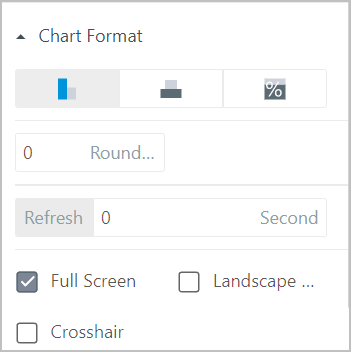
Column Chart
Often used to compare values at different times or under different conditions.
| Parameter | Description |
|---|---|
| Column Type | How columns are displayed on the canvas based on the selected data source. |
| Rounded Corner | Size of the rounded corner of columns. |
| Refresh | Refresh interval of the chart. |
| Full Screen | Whether to display the full screen icon at the upper-right corner to enable full screen in operation center. |
| Landscape Display | Enable to switch X and Y axis, and the chart changes to horizontal view. |
| Crosshair | Set whether to display crosshairs when mouse moves. |
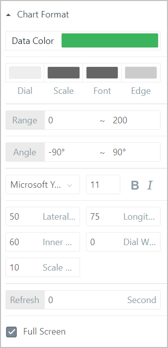
Dashboard
Dashboard binds with numeric real-time data.
| Parameter | Description |
|---|---|
| Data Color | Data color displayed on the dashboard. |
| Style | Colors of the dashboard dial, scale, value font and edge. |
| Range | Range of the dashboard. |
| Angle | Start and end angle of the dashboard. When they add up to 360°, a circle is formed. |
| Scale Style | Font family, size, weight and italic of the scale. |
| Lateral/Longitudinal Offset | Dashboard position horizontally and vertically. |
| Inner Radius | Radius of the dashboard inner edge. |
| Dial Width | Width of the dashboard edge. |
| Scale Length | Length of the scale lines. |
| Full Screen | Whether to display the full screen icon at the upper-right corner to enable full screen in operation center. |
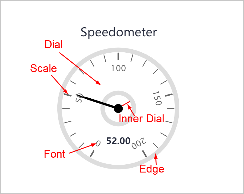
Speedometer
Speedometer binds with numeric real-time data.
- Chart Format
| Parameter | Description |
|---|---|
| Style | Colors of the speedometer dial, scale, value font and edge. |
| Range | Range of the speedometer. |
| Angle | Start and end angle of the speedometer. When they add up to 360° (neither can exceed 180), a circle is formed. |
| Scale Style | Font family, size, weight and italic of the scale. |
| Lateral/Longitudinal Offset | speedometer position horizontally and vertically. |
| Inner Radius | Radius of the speedometer inner edge. |
| Dial Border Width | Width of the speedometer border. |
| Scale/Minor Scale Length | Length of the scale lines. |
| Total Number of Scales | The number of scales on the speedometer. |
| Scale Offset | Offset of scale size relative to standard dial size. The larger the value, the larger the dial. |
| Refresh | Refresh interval of the chart. |
| Full Screen | Whether to display the full screen icon at the upper-right corner to enable full screen in operation center. |
| Connect Scale | Set whether to connect the start and end of the speedometer border. |
- Pointer
| Parameter | Description |
|---|---|
| Pointer Width | Pointer body width. |
| Pointer Tip | Width of the pointer tip. |
| Pointer | Pointer length. |
| Pointer Tail | Length of the pointer tail. |
| Pointer Color | Pointer color. |
| Stroke | Width and color of the pointer border. |
| Center Diameter | Diameter and color of the pointer pivot. |
| Stroke | Width and color of the pointer pivot border. |
- Identification Area
| Parameter | Description |
|---|---|
| Start/End Value | The start and end value of the identification area on the axis. |
| ID Zone Width | Area width on the axis. |
| Gradient Position | Area color. Gradual color change is available. |
Bubble Chart
Displays data distribution.
| Parameter | Description |
|---|---|
| Data Source | Aside from general information, select a field to be the bubble size source and set its color. |
| Chart Format |
|
Scatter Plot
Displays data distribution.
| Parameter | Description |
|---|---|
| Full Screen | Whether to display the full screen icon at the upper-right corner to enable full screen in operation center. |
| Landscape Display | Enable to switch X and Y axis, and the chart changes to horizontal view. |
| Crosshair | Set whether to display crosshairs when mouse moves. |
Pie
Displays the ratio between each section of data and the whole.
Annular Chart is similar to pie chart.
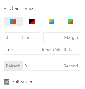
| Parameter | Description |
|---|---|
| Color | Color scheme of the pie chart. |
| Inner Radius | Set the radius of the inner circle around the origin. |
| Margin | Distance between pie sections. |
| Inner Cake Ratio | Sum of inner section ratio. It is 100% by default. |
| Refresh | Refresh interval of the chart. |
| Full Screen | Whether to display the full screen icon at the upper-right corner to enable full screen in operation center. |
Funnel Chart
Often used to display the data decreasing. Funnel chart automatically sorts the data, and for different sorting sequence, you can convert the funnel chart to a pyramid.
| Parameter | Description |
|---|---|
| Type | Select between funnel chart and pyramid. |
| Neck Width/Height | The width and height of the funnel neck part. |
| Border Width | Set the border width and color of the funnel chart. |
| Refresh | Refresh interval of the chart. |
| Full Screen | Whether to display the full screen icon at the upper-right corner to enable full screen in operation center. |
Spider Chart
Mainly used to evaluate each index of a data set. X axis represents index variables and Y axis stands for the distance between the origin to each data point, which indicates the evaluation of each index.
| Parameter | Description |
|---|---|
| Line Style | Line type and width. |
| Node | Node type, size and stroke width.
|
| Refresh | Refresh interval of the chart. |
| Full Screen | Whether to display the full screen icon at the upper-right corner to enable full screen in operation center. |
Spc Diagram
Analyzes and judges whether the procedure is stable. The spc diagram has uppr and lower limits.
| Parameter | Description |
|---|---|
| SPC Chart Type |
|
| Line Style | Line type and width. |
| Decimal Places | Secimal places of the data. |
| Specific Line Style | Set the style for each specific line, including line type, width and color. |
| Node | Node type, size and stroke width. |
| Full Screen | Whether to display the full screen icon at the upper-right corner to enable full screen in operation center. |
Histogram
Accurately displays data distribution. You can distribute data to multiple sections, and integrate data distribution in each section.
| Parameter | Description |
|---|---|
| Fitting Line | Select the fitting line type. |
| Full Screen | Whether to display the full screen icon at the upper-right corner to enable full screen in operation center. |
Progress Bar
| Parameter | Description |
|---|---|
| Style | Progress bar type.
|
| Chart Style | Set the background color of the progress bar, and whether to enable full screen. |
| Data Title | Title style of the progress bar. |
| Progress Value | Progress style of the progress bar. You can also set it to be displayed inside each bar. |
| Show Data | Style of current and total data of each bar. |
Form Library
This section describes general properties of form elements.
General Attributes
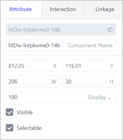
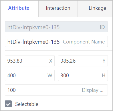
- Attribute
| Parameter | Description |
|---|---|
| ID | Automatically generated. You can use it for writing scripts. |
| Component Name | Element name. It cannot be repeated. |
| X/Y | Center coordinate of the element. |
| W/H | Width and height of the element. |
| Display Level | Relative display priority of the element. The higher the level, the more front the chart is displayed. |
| Visible | Set whether the element is visible in operation center. |
| Selectable | Set whether the element can be selected. |
Interaction: Set interaction events. For details, see Interaction.
Linkage: Link the data source with other elements to achieve linkage effect. For details, see Data Linkage in Free Layout and Data Linkage in Grid Layout.
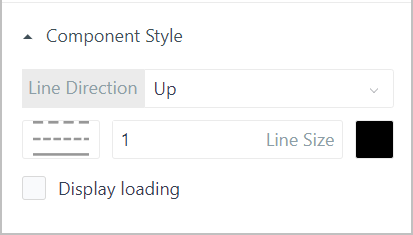
Line
Used only for static display. The line is horizontal by default.
| Parameter | Description |
|---|---|
| Line Direction | Select to display one side line of the rectangle you drew on the canvas after selecting Line from the left side. For example, set Line Direction to Left, a vertical line on the left side of the rectangle you drew is displayed. |
| Line Style | Line type, size and color. |
| Display Loading | Set whether to display loading animation in operation center. |
Label
Mainly displays text and background.
- Component Style
| Parameter | Description |
|---|---|
| Content Source |
|
| Label Content |
|
| Content Style | Content font family, size, weight, italic, unit, text alignment and color. |
| Mouse Style | Set cursor style when it hovers over the label in operation center. |
| Required ID | Set whether it is required. If it is, a red * is displayed in front. |
| Beyond Truncation | Whether to display more content that exceeds the label as .... |
| Top/Right/Bottom/Left Fixed | Fix the element (size and position) based on its left/right/top/bottom border, and remains the same for different resolution and page position. |
| Display Loading | Set whether to display loading animation in operation center. |
- Refresh: Select whether to allow refresh and refresh frequency.
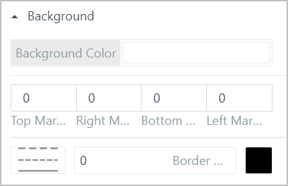
- Background
| Parameter | Description |
|---|---|
| Background Color | Set the label background color. |
| Margin | Distance between the label content and label window border on all 4 directions. |
| Style | Label window border line type, size and color. |
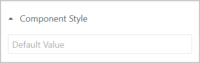
Hidden Field
Visible in design center but not in operation center. Hidden area is often used for collecting or sending information and data delivery.
| Parameter | Description |
|---|---|
| Default Value | Set the default value of the hidden area with a data type of string. |
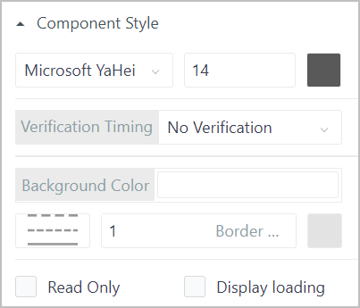
Input Box
As input parameters, often used to be linked with tables or reports for associated query.
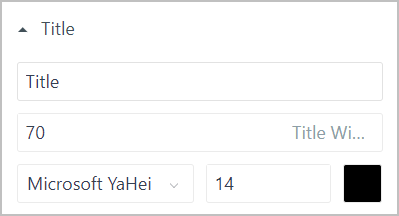
- Title: Set the title name and style of the input box, including title width, font family, size and color.
- Component Style
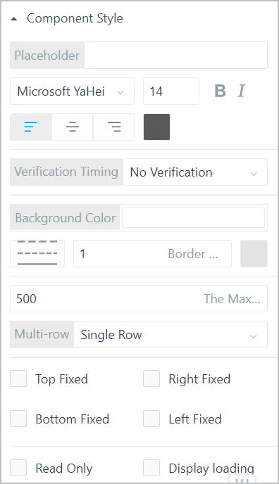
| Parameter | Description |
|---|---|
| Placeholder | Enter placeholder of the input box, and set its style. |
| Verification Timing | Set whether to apply verification to the element and time. |
| Background Color | Set background color of the input box, and set its style. |
| The Maximum Length | The maximum length of entered text. |
| Multi-row | Select input text lines between Single Row or Multi-row. |
| Top/Right/Bottom/Left Fixed | Fix the element (size and position) based on its left/right/top/bottom border, and remains the same for different resolution and page position. |
| Read Only | Set the read and write status of the element. When set to Read Only, you cannot edit it in operation center. |
| Display Loading | Set whether to display loading animation in operation center. |
Drop-down Box
As input parameters, often used to be linked with tables or reports for associated query.
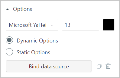
- Options
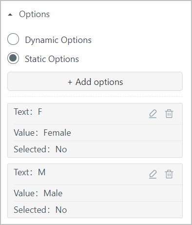
| Parameter | Description |
|---|---|
| Dynamic Options | Click Bind data source to select a dynamic data source as the drop-down options. |
| Static Options | Click Add options to manually enter options to be the drop-down list. |
- Title: Set the title name and style of the drop-down box, including title width, font family, size and color.
- Pagination: Select whether to display pagination and set page size.
- Refresh: Select whether to allow refresh and refresh frequency.
- Component Style
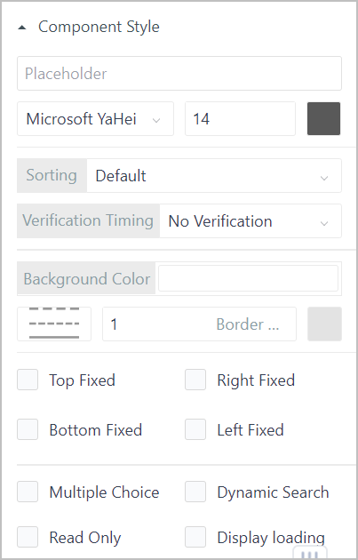
| Parameter | Description |
|---|---|
| Placeholder | Enter placeholder of the drop-down box, and set its style. |
| Verification Timing | Set whether to apply verification to the element and time. |
| Background Color | Set background color of the drop-down box, and set its style. |
| Top/Right/Bottom/Left Fixed | Fix the element (size and position) based on its left/right/top/bottom border, and remains the same for different resolution and page position. |
| Multiple Choice | Whether to allow multiple choice for the drop-down box. |
| Dynamic Search | Whther to enable fuzzy matching when searching for options. |
| Read Only | Set the read and write status of the element. When set to Read Only, you cannot edit it in operation center. |
| Display Loading | Set whether to display loading animation in operation center. |
Cascader
Provides related data sets for selection.
- Options:Click Bind data source to add a data source for the cascader.
- Title: Set the title name and style of the cascader, including title width, font family, size and color.
- Refresh: Select whether to allow refresh and refresh frequency.
- Component Style
| Parameter | Description |
|---|---|
| Style | Set the style of cascader content. |
| Verification Timing | Set whether to apply verification to the element and time. |
| Background Color | Set background color of the cascader, and set its style. |
| Read Only | Set the read and write status of the element. When set to Read Only, you cannot edit it in operation center. |
| Display Loading | Set whether to display loading animation in operation center. |
Radio
- Options
| Parameter | Description |
|---|---|
| Dynamic Options | Click Bind data source to select a dynamic data source as radio options. |
| Static Options | Click Add options to manually enter options to be radio options. |
- Title: Set the title name and style of the drop-down box, including title width, font family, size and color.
- Refresh: Select whether to allow refresh and refresh frequency.
- Component Style
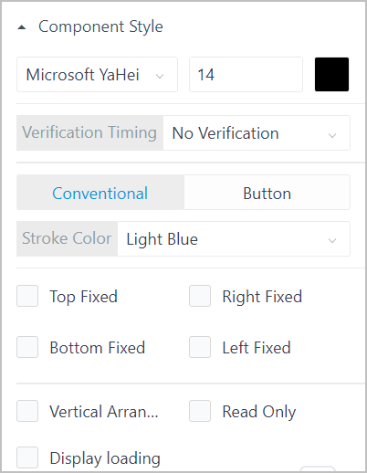
| Parameter | Description |
|---|---|
| Text Style | Font family, size and color of the radio option text. |
| Verification Timing | Set whether to apply verification to the element and time. |
| Radio Type |
|
| Top/Right/Bottom/Left Fixed | Fix the element (size and position) based on its left/right/top/bottom border, and remains the same for different resolution and page position. |
| Vertical Arrangement | Whether to arrange all options vertically. |
| Read Only | Set the read and write status of the element. When set to Read Only, you cannot edit it in operation center. |
| Display Loading | Set whether to display loading animation in operation center. |
- Options/Title/Refresh: Same as Radio.
- Component Style
| Parameter | Description |
|---|---|
| Text Style | Font family, size and color of the checkbox option text. |
| Verification Timing | Set whether to apply verification to the element and time. |
| Select All | Whether to allow selecting all options. |
| Check Box |
|
| Top/Right/Bottom/Left Fixed | Fix the element (size and position) based on its left/right/top/bottom border, and remains the same for different resolution and page position. |
| Read Only | Set the read and write status of the element. When set to Read Only, you cannot edit it in operation center. |
| Display Loading | Set whether to display loading animation in operation center. |
Date Picker
As input parameters, often used to be linked with tables or reports for associated query. Input format can be date, time or date and time.
- Title: Set the title name and style of the drop-down box, including title width, font family, size and color.
- Component Style
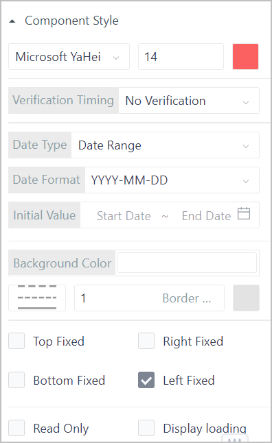
| Parameter | Description |
|---|---|
| Text Style | Font family, size and color of the selected date text. |
| Verification Timing | Set whether to apply verification to the element and time. |
| Date Type | Select the date type, and set corresponding Date Format and Initial Value. |
| Background Color | Set background color of the date picker, and set its style. |
| Top/Right/Bottom/Left Fixed | Fix the element (size and position) based on its left/right/top/bottom border, and remains the same for different resolution and page position. |
| Read Only | Set the read and write status of the element. When set to Read Only, you cannot edit it in operation center. |
| Display Loading | Set whether to display loading animation in operation center. |
Button
Triggers click events, such as click to search and click to open another page.
- Component Style
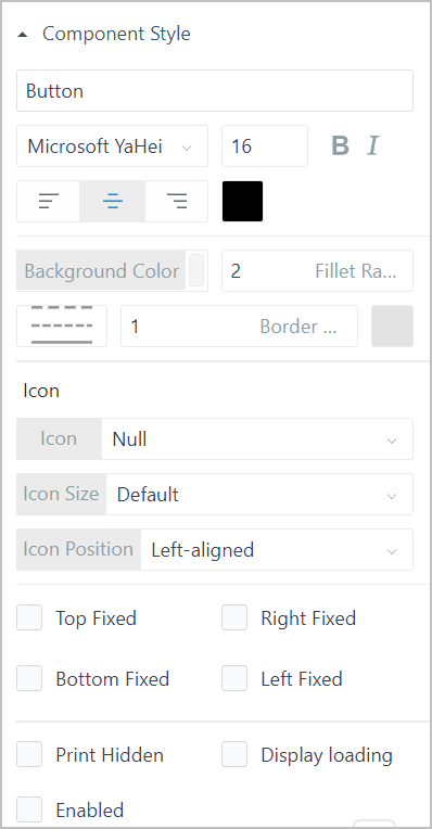
| Parameter | Description |
|---|---|
| Text | Enter the text displayed on the button and set its styles. |
| Background Color | Set background color of the date picker, and set its style. |
| Icon | Select the icon displayed before the button text, and set the icon size and position. |
| Top/Right/Bottom/Left Fixed | Fix the element (size and position) based on its left/right/top/bottom border, and remains the same for different resolution and page position. |
| Print Hidden | Whether to hide the button when printing. |
| Display Loading | Set whether to display loading animation in operation center. |
| Enabled | Whether to disable the button. |
- Button Group Configuration
By switching between multiple buttons, you can use one process workflow or graphic group to display different data.
The button group function is only available for graphic elements.
Select graphic elements and then set their dynamic effects. For details, see Dynamic Effect.
Select those graphic elements, and then right-click to group them.
Add a button on the canvas.
Click the button, and then click Configure Point Groups under Interact.
Click Configure in the pop-up window, and then select a data source to replace the original one. Do the same for multiple buttons.

After configuration, you can click different buttons to view corresponding data and dynamic effects in operation center.
Tree
Displays hierarchical relations between equipment. Generally the tree element is used together with factory models. You need to write script for each node on the tree to link with designed pages.
Make sure you have installed factory model APP in the supOS platform before binding a tree element with a factory model.
- Data Source: Data source for tree element display.
- Title: Tree title.
- Refresh: Select whether to allow refresh and refresh frequency.
- Component Style
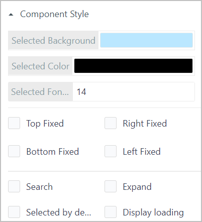
| Parameter | Description |
|---|---|
| Selected Background | Background color of selected node. |
| Selected Color | Text color of selected node. |
| Selected Font | Text font size of selected node. |
| Top/Right/Bottom/Left Fixed | Fix the element (size and position) based on its left/right/top/bottom border, and remains the same for different resolution and page position. |
| Search | Whether to add search box for the tree element. |
| Expand | Whether to expand the tree in operation center. |
| Selected by default | Whether to select the root node by default. |
| Display Loading | Set whether to display loading animation in operation center. |
Single List
Switch and display multiple pages in the form of parallel menus.
- Data Source: Select a data source with multiple fields for the list, and select one field for display.
- Title: List title and its styles.
- Refresh: Select whether to allow refresh and refresh frequency.
- Component Style
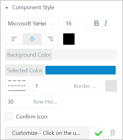
| Parameter | Description |
|---|---|
| Style | List text style, including font family, size, weight, italic, alignment and color. |
| Background Color | Background color of the list. |
| Selected Color | Background color of selected item. |
| Border | Border line type, width and color. |
| Row Height | Height of each item row. |
| Confirm Icon | Whether to display a confirm icon, and you can upload other icons. |
Table
Displays large amount of structured data and often linked with buttons, input boxes for data linkage. The data source can be database tables or services of the bound object properties. You can integrate, search for and export important system and on-site data.
Data inside table cells can be links, buttons, images or time.
- Data Source: Data source for table display.
- Title: Table title and its styles.
- Header
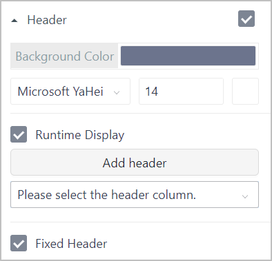
| Parameter | Description |
|---|---|
| Background Color | Header background color and header text font family, size and color. |
| Runtime Display | Whether to allow adjusting header items in operation center by displaying a drop-down list at the upper-right corner. |
| Add Header | Manullay add header or select header from the added data source fields. |
| Fixed Header | Freeze the table header. |
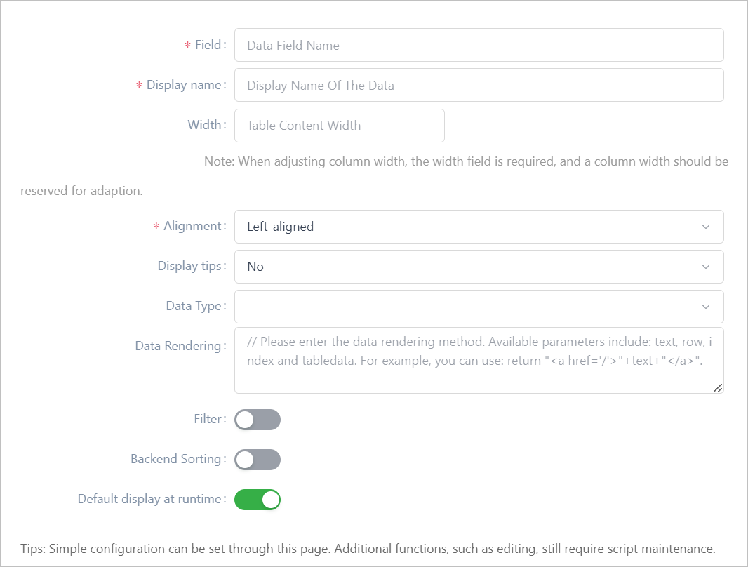
| Parameter | Description |
|---|---|
| Field/Display name | Set the field name and display name on the table. |
| Width | Column width on the table. If left empty, all columns will be the same width. |
| Alignment | The text alignment of both table header and body. |
| Display tips | Whether to display tips when cell content exceeds the column width and mouse hovering over it. |
| Data Type | Data type of the current column. |
| Data Rendering | Enter functions to render original data. Input parameters are |
| Filter | Whether to enable filter on the table. You can add multiple keywords or conditions to specify the search.
|
| Backend Sorting | Whether to enable sorting. Unavailable for data source from services or SQL query. |
| Default display at runtime | Whether to display the current field by default in operation center. |
- Table Body
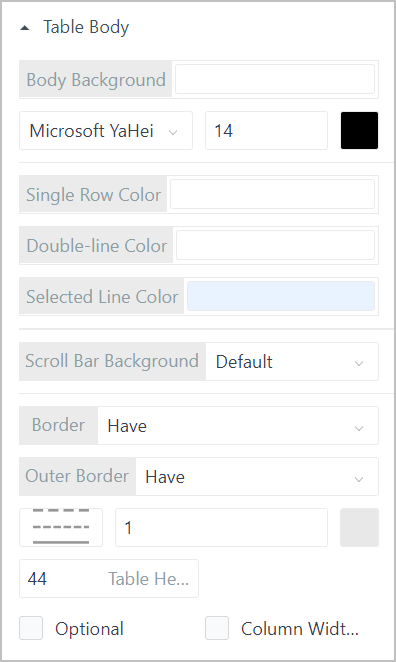
| Parameter | Description |
|---|---|
| Background Color | Set background color of the table body, and set the table content style. |
| Single Row Color/Double-line Color | Set the background color of the table odd and even rows. |
| Selected Line Color | Background color of selected rows. |
| Scroll Bar Background | Background color of the scroll bar. |
| Border/Outer Border | Select whether the table has both inner and outer border and set their styles. |
| Table Height | Height of table columns. |
| Optional | Whether to allow selecting columns on the table. |
| Column Width Adjustment | Whether to allow adjusting column width in operation center. Width will restore to the original once refreshing the page. |
- Pagination
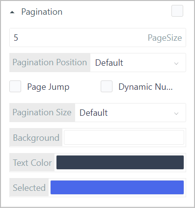
| Parameter | Description |
|---|---|
| Page Size | Number of items displayed on one page. |
| Pagination Position | Where the page number is displayed. |
| Page Jump | Whether to allow jumping between pages. |
| Dynamic Number of Items | Whether to allow changing the number of items on each page in operation center. |
| Pagination Size | Size of pagination modules. |
| Background/Text Color/Selected | Color of the pagination modules, text and selected page. |
- Refresh: Select whether to allow refresh and refresh frequency.
- Component Style
| Parameter | Description |
|---|---|
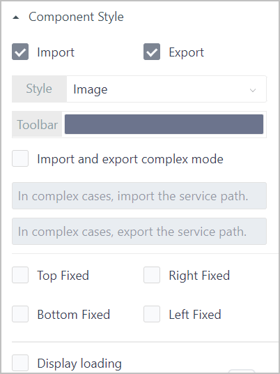
| Import/Export | Whether to allow import and export table data. info
|
| Style | Set the import and export button styles. |
| Toolbar | Set the background color of the toobar which contains the import and export buttons. |
| Import and export complex mode | Necessary for import and export when the data source is a service, and corresponding paths are required. |
| Top/Right/Bottom/Left Fixed | Fix the element (size and position) based on its left/right/top/bottom border, and remains the same for different resolution and page position. |
| Display Loading | Set whether to display loading animation in operation center. |
Picture
Uploads pictures for display. General image types are supported and you can directly drag them to the designer.
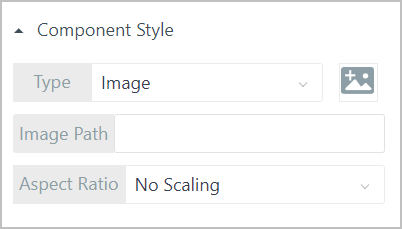
| Parameter | Description |
|---|---|
| Type |
|
| Image Path | Automatically generated when uploading pictures. You can also manually enter corresponding URL. |
| Aspect Ratio | Background image display.
|
Tabs
Used for switching between multiple tabs.
- Options
| Parameter | Description |
|---|---|
| Text Style | Tab name styles, including font family, size and color. |
| Dynamic Options | Click Bind data source to select a dynamic data source as radio options. |
| Static Options | Click Add options to manually enter options to be radio options. |
- Refresh: Select whether to allow refresh and refresh frequency.
- Component Style: Set whether to display loading animation in operation center.
Upload
Set the interaction event of the element to Upload Complete, and write corresponding script. In operation center, you can directly click the Upload button to upload files.
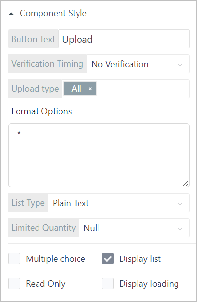
| Parameter | Description |
|---|---|
| Button Text | Enter the text on the button. |
| Verification Timing | Set whether to apply verification to the element and time. |
| Upload Type | Select the supported file type, and corresponding code will be displayed under Format Options. |
| List Type | Types of the uploaded file list. |
| Limited Quantity | The upper limit of uploaded files. |
| Multiple Choice | Whether to allow multiple choice for the drop-down box. |
| Display List | Whether to display uploaded files. |
| Read Only | Set the read and write status of the element. When set to Read Only, you cannot edit it in operation center. |
| Display Loading | Set whether to display loading animation in operation center. |
Bread Crumbs
Displays the current page hierarchy. Generally used in multi-level navigation.
Bread crumbs depend on script configuration to render and interaction events to interact.
Search
Allows user to search for contents in need. Fuzzy match is available.
- Title: Set the title name and style of the search box, including title width, font family, size and color.
- Data Source
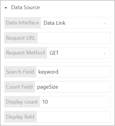
| Parameter | Description |
|---|---|
| Data Interface |
|
| Search Filed | Search field key corresponding to the data source. |
| Count Field | Number of results field key corresponding to the data source. |
| Display Count | Number of results to be displayed. |
| Display Field | Field corresponding to the results. |
- Component Style
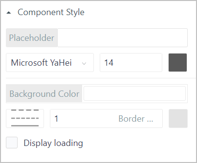
| Parameter | Description |
|---|---|
| Placeholder | Enter placeholder of the search box, and set its style. |
| Background Color | Set background color of the search box, and set its style. |
| Display Loading | Set whether to display loading animation in operation center. |
Make sure the corresponding fields used in request address, method, search field, count field, display count, display field are the same as the data source.
Date
Displays the current date.
- Style Format: Displayed date style and format.
- Background: Background color, filleted corner size, border width and color of the element.
Time
Displays the current time.
- Style Format: Displayed time style and format.
- Background: Background color, filleted corner size, border width and color of the element.
Controls Library
General Attributes
- Attribute
| Parameter | Description |
|---|---|
| ID | Automatically generated. You can use it for writing scripts. |
| Component Name | Element name. It cannot be repeated. |
| X/Y | Center coordinate of the element. |
| W/H | Width and height of the element. |
| Display Level | Relative display priority of the element. The higher the level, the more front the chart is displayed. |
| Selectable | Set whether the element can be selected. |
Interaction: Set interaction events. For details, see Interaction.
Linkage: Link the data source with other elements to achieve linkage effect. For details, see Data Linkage in Free Layout and Data Linkage in Grid Layout.
Real-Time Alarm and History Alarm
Both alarm elements automatically link with the set alarms in object instances.
- Real-time alarm: When an alarm is triggered, you can confirm the alarm information in operation center.
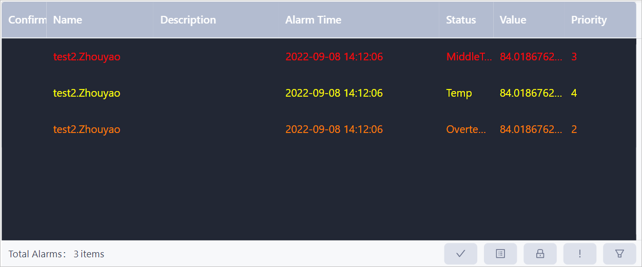
- History alarm: You can view all history alarms in time descending order.
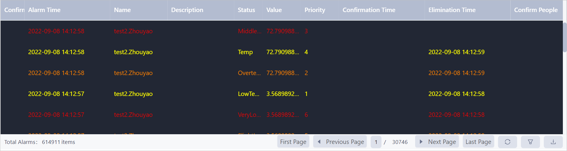
| Parameter | Description |
|---|---|
| Basic Configuration | Set the background color of the bottom control bar, alarm list and top title bar and title text color. |
| Refresh | Select whether to allow refresh and refresh frequency. |
Drive Video
Displays real-time video and video playback is available.
- Real Time
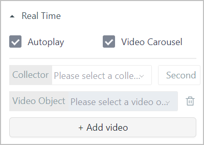
| Parameter | Description |
|---|---|
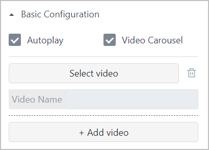
| Autoplay | Whether to play the video automatically when browsing the page. |
| Video Carousel | Whether to enable playing added videos in turn and repeatedly. Click Add video to add up to 5 video sources, and set the playing peroid. |
| Collector | Select the collector that collects the video source. |
| Video Object | Object instance that represents the video source. |
- Playback
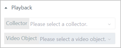
| Parameter | Description |
|---|---|
| Collector | Select the collector that collects the playback video source. |
| Video Object | Object instance that represents the playback video source. |
Video Wall
Binds with multiple video elements and arranges them. You can switch real-time video and history video on each video element in operation center.
- Layout: Set the number of rows and columns on the video wall. Title: Set the title name and style of the video wall.
- Real Time
| Parameter | Description |
|---|---|
| Autoplay | Whether to play the video automatically when browsing the page. |
| Video Carousel | Whether to enable playing added videos in turn and repeatedly. Click Add video to add up to 5 video sources, and set the playing peroid. |
| Collector | Select the collector that collects the video source. |
| Video Object | Object instance that represents the video source. |
- Playback
| Parameter | Description |
|---|---|
| Collector | Select the collector that collects the playback video source. |
| Video Object | Object instance that represents the playback video source. |
Video
Plays uploaded videos.
| Parameter | Description |
|---|---|
| Autoplay | Whether to play the video automatically when browsing the page. |
| Video Carousel | Whether to enable playing added videos in turn and repeatedly. Click Add video to add up to 5 video sources, and set the playing peroid. |
| Select video | Select or upload videos. |
Timer
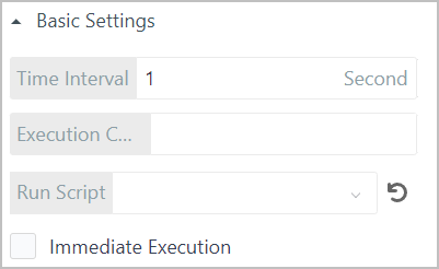
| Parameter | Description |
|---|---|
| Time Interval | Interval of timer execution. |
| Execution Count | Number of time execution. |
| Run Script | Select to run refresh or custom scripts to achieve certain functions. |
| Immediate Execution | The script will be immediately executed after component loading. Enable it and 1 time will be deducted from the Execution Count. |
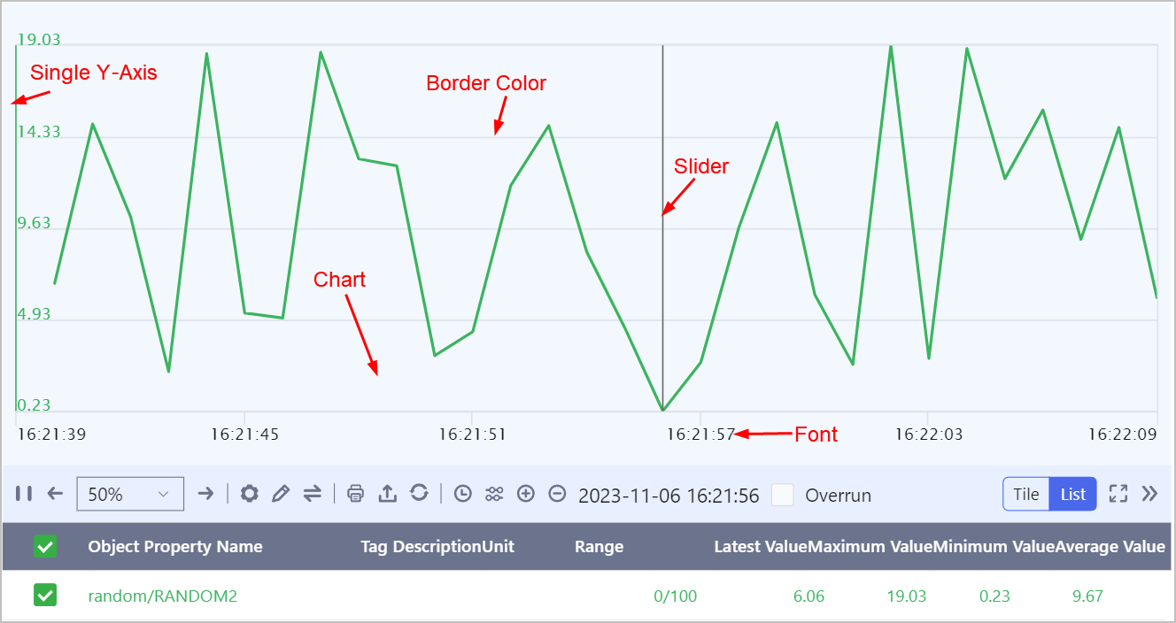
Trend Chart
Binds multiple data sources and records data points at a set time interval to form a trend chart. The trend is dynamically refreshed.
In free layout, trend parameters configured in operation center are saved immediately, but not in grid layout.
| Parameter | Description |
|---|---|
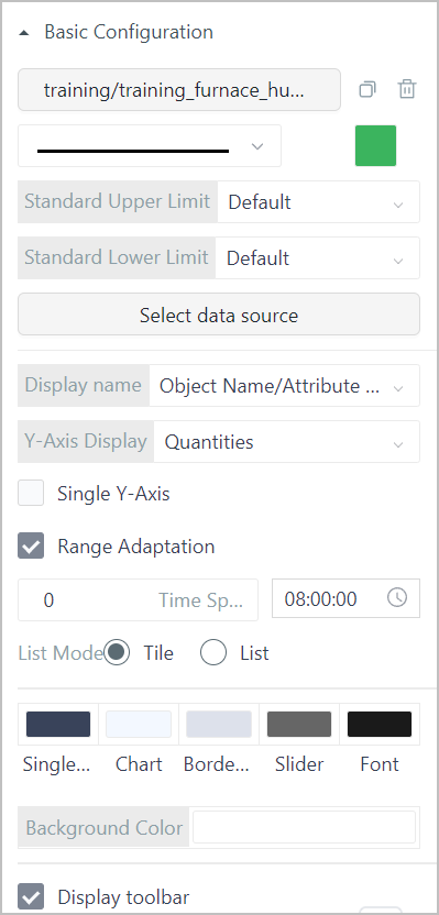
| Select data source | Select a numeric data source. You can select up to 8 data sources and configure different line styles, colors and ranges for them. |
| Display name | Select the name for the data source displayed on the trend chart when hovered over. |
| Y-Axis Display | Select from Quantities and Percentage. Percentage converts from quantity automatically. |
| Single Y-Axis | Enable it to display only one range of Y axis and it integrates all data sources, meaning the upper/lower limit of a single Y axis is the highest/lowest limit from all data sources. info When it is disabled, ranges of all data sources will be displayed on the Y axis interchangeably according to the current selected data source. |
| Range Adaptation | The Y axis adapts its range according to data value. |
| Time Span | Time period that the trend chart covers. The default is 8 hours. |
| List Mode | Select to display multiple properties that are currently opened in tiles or lists. info By default, only two rows are displayed, and you can scroll to view more. |
| Style | Set colors of chart background, aixs line, border, slider and scale font. |
| Display toolbar | Whether to display toolbar at the bottom. |
Report
Data sources of report element can be object instances, templates, service real-time data or relational database, and database can either be from third-party or manually creation. The report element is often linked with buttons, search boxes, input boxes to search for and export important data.
Attribute Configuration
- Basic Configuration
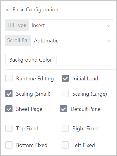
| Parameter | Description |
|---|---|
| Fill Type | - Replace: Original data is replaced when filling the bound data source. - Insert: A new column or row is added when filling the bound data source. |
| Scroll Bar | Set display mode of the scroll bar. When setting to Automatic, data inside the report exceeds the element width and the scroll bar is displayed. |
| Background Color | Set background color of the element. |
| Runtime Editing | You can edit the report in operation center. Often used when you need to fill in the report. |
| Initial Load | Whether to enable automatic loading of the report data in operation center. |
| Top/Right/Bottom/Left Fixed | Fix the element (size and position) based on its left/right/top/bottom border, and remains the same for different resolution and page position. |
| Scaling (Small)/Scaling (Large) | Font size in the report adapts to the resolution when it increases/decreases. |
| Sheet Page | Displays sheets on the bottom. |
| Default Pane | Whether to enable default parent cell when adding data source. |
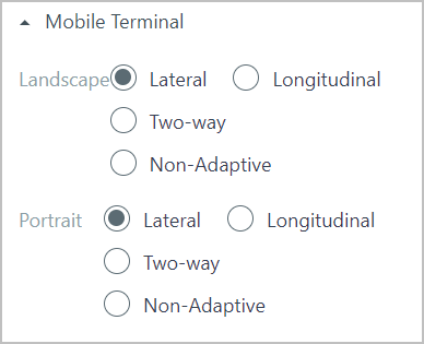
- Mobile: Set the display mode of the report on mobile clients, and it adapts to the client resolution.
For more operations on report, see Operations on Report.
Web Page
Displays other web pages, designed pages through attributes or services and supOS static resource links.
- Web Page
| Parameter | Description |
|---|---|
| Dynamic Options | Click Bind data source to select a dynamic data source as the web page link. |
| Static Options | Manually enter a web page link. |
| Margin | Distance between the webpage and the element border. |
| Padding | Distance between the webpage content and the webpage border. |
| Background | Background color, border line type, width and color of the webpage. |
| Sandbox | Whether to enable a sandbox to test the web page. |
| De-Iframe | Enable it and the set pop-up windows are prompted in local browser; if disabled, they are prompted inside the element. |
- Refresh: Select whether to allow refresh and refresh frequency.
- Title: Set whether to display title and title styles, and margin from all sides.
Carousel
Binds multiple web pages or images by url and play them in cycles at the set time interval.
- Settings
| Parameter | Description |
|---|---|
| Carousel Frequency | Time interval between turns of video carousel. |
| Forced Carousel | Whether to allow video to keep playing when hovered over. |
| Play Source | Select images, webpages or supOS internal pages to play. |
| URL | Click  to add a URL of an image or webpage. Up to 20 URLs can be added to the carousel. to add a URL of an image or webpage. Up to 20 URLs can be added to the carousel. |
- Style
| Parameter | Description |
|---|---|
| Border | Border line type, width amd color. |
| Page-turning Arrow | Whether to display the arrow for page turning which allows user to flip pages by clicking the arrow in operation center. |
| Carousel Page Number | Whether to display page symbols in operation center. You can click the symbol to turn pages. |
| Preload | Enable it and all pages will be loaded during initialization in operation center. If not enabled, only the first two pages are loaded. |
Calendar
Bind with object services and you can link announcements with the calendar element to remind users. The announcements can be to do tasks or other notifications.
- Basic Settings
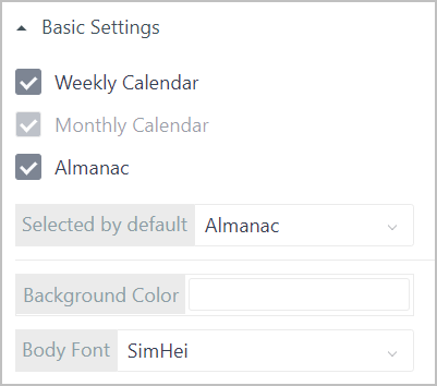
| Parameter | Description |
|---|---|
| Calendar Type | Select the displayed calendar type. |
| Selected by default | Set the calendar type that is selected and displayed by default. |
| Background Color/Body Font | Calendar background color and text font family. |
- Top Style
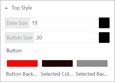
| Parameter | Description |
|---|---|
| Date Size | Size and color of the year at the upper-left corner |
| Button Size | Size and text color of the buttons at the upper-right corner. |
| Button Style | Button background color, selected button text color and selected button background color. |
- Head Style: Weekday styles, including font family, size, color and background color, under weekly and monthly calendars.
- Body Style
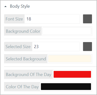
| Parameter | Description |
|---|---|
| Font Size/Background Color | Font size and background color of each day/month on the calendar. |
| Selected Size/Selected Background | Font size and background color of the selected day/month. |
| Background Of The Day/Color Of The Day | Background color and font color of the current day. |
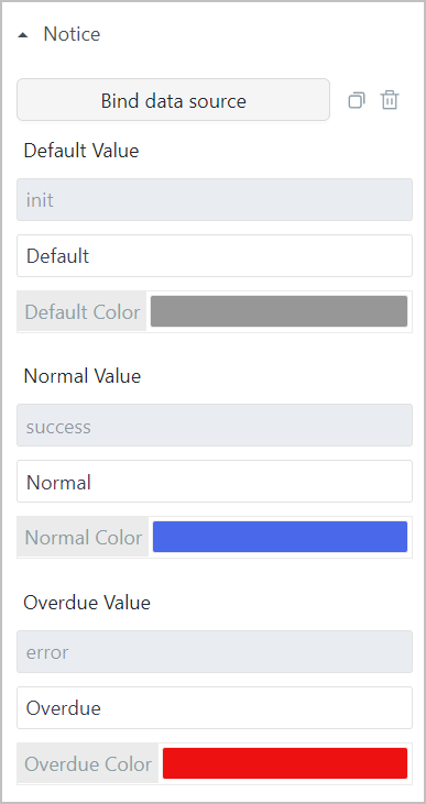
- Notice: Set the style of notices that are linked with calendar through binding object services.
- Refresh: Select whether to allow refresh and refresh frequency.
Programmable Component
Design custom elements by writing scripts. For details on building local development enviornment, see Progammable Component.
To Do List
Automatically links with workflows of the current APP, and you can manage all your to-do items through this element.
List Description
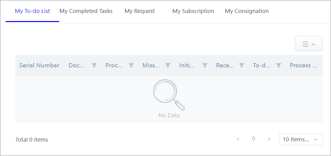
- My To-do List: Displays to do tasks of user.
- My Completed Tasks: Displays tasks submitted by user.
- My Request: Displays tasks initiated by user and the current progress can be viewed.
- My Subscription: Displays tasks subscribed by user and the current progress can be viewed.
- My Consignation: Displays tasks entrusted by user and it can be cancelled.
Click process links to go to the corresponding workflow details page.
Data Configuration
- Options
You can set the content displayed on each list. The table below takes to do list as an example.
- Under Attribute List, click
 to display the item on the list.
 - Click
 to set the style of the corresponding field.
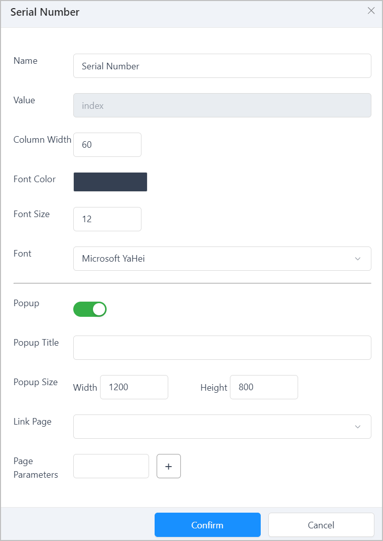
| Parameter | Description |
|---|---|
| Name | Attribute name displayed on the list. |
| Value | Name of a component that is on pages related to a workflow. |
| Column Width | Column width of the current attribute on the list. |
| Font | Font color, size and family displayed on the list. |
| Popup | Whether to enable popup window for the current attribute, and set its title and window size. |
| Link Page | Select a page displayed on the popup window. |
| Page Parameters |
- Click Add custom attributes to display other custom attributes of the APP on the list. Make sure to enter Component ID of an element on the APP in Value box to link corresponding data.
- Component Style
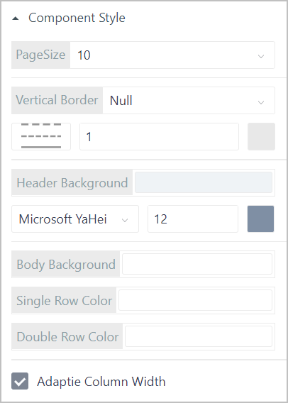
| Parameter | Description |
|---|---|
| PageSize | Set the number of items displayed on each page. |
| Vertical Border | Set whether vertical border exists and its width, color and type. |
| Header Background | Set the background color, text font family, size and color of the table header. |
| Table Background | Set the background color of the table body. |
| Single/Double Row Color | Background color of odd/even rows on the table. |
| Adaptive Column Width | Whether the column width is adaptive to its parent window. |
Graphic Library
The supOS platform provides multiple graphic elements to form different industrial process flowchart. With dynamic effects, you can directly view equipment status through flowcharts.
- General Attributes
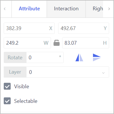
| Parameter | Description |
|---|---|
| X/Y | Center coordinate of the element. |
| W/H | Width and height of the element. |
| Rotate | Rotation angle of the shapes, and you click icons to directly flip them. |
| Layer | The layer where the shape is displayed. |
| Visible | Set whether the element is visible in operation center. |
| Selectable | Set whether the element can be selected. |
Interaction: Set interaction events. For details, see Interaction.
Linkage: Link the data source with other elements to achieve linkage effect. For details, see Data Linkage in Free Layout.
Shapes
Contains irregular shape, circle, rectangle, oval, rounded rectangle, polygon, custom shape, triangle, star and arc.
For irregular shapes, double-click the last point and then double-click the canvas to finish drawing.
- Basic Attributes
| Parameter | Description |
|---|---|
| Diameter | Circle diameter. For circles only. |
| Graphics | Shape of the custom shape element. |
| Number of edges | Edges of a polygon. For polygons only. |
| Starting/End Angle | Start and end angle of the arc. For arcs only. |
| Fillet Radius | Filleted corner size of the rounded rectangle. For rounded rectangles only. |
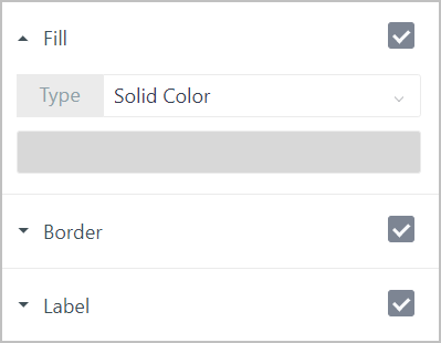
- Fill: Select the filling color of the shape from Solid Color and Gradient. For Gradient, start and end colors, and gradient type are required.
- Border: Set whether to display borders of shapes, and their width, color and type.
- Label: Set whether to display a label at the upper-right corner of shapes, and set the content, content style and background color.
- Hotspot: Once enabled, Fill color is invalid, and the set hotspot color will be displayed on shape border in operation center when hovered over. For irregular shapes only.
You can set dynamic effects for shapes. For details, seeDynamic Effect.
Text
- Character
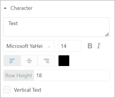
| Parameter | Description |
|---|---|
| Text | Content and style of the text. |
| Row Height | Line height when wrapping the text. |
| Vertical Text | Whether to display text vertically. |
- Fill: Background color of the text.
- Label: Set whether to display a label at the upper-right corner of the text box, and set the content, content style, background color and border style.
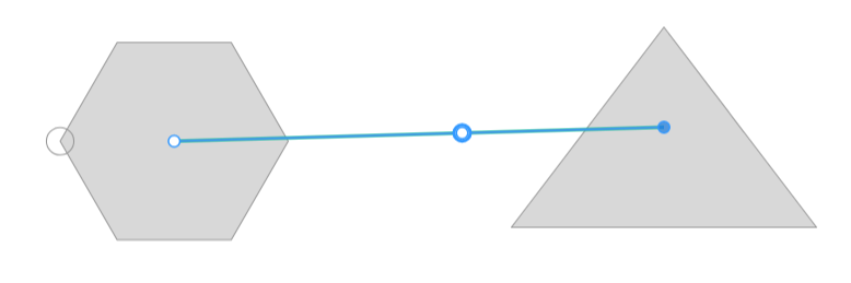
Edge
Connects two graphic elements together.
- Drag 2 graphic elements to the canvas.
- Click the Edge element, and then click on one graphic element and connect to another one.
- Select the connection line, and then set its attributes such as display layer, style and label on the right side.
- (optional) Double-click the connection line to add breaking points to it.
Image
Click Upload image on the right side under Fill to add an image to the canvas. You can set labels for it too.
Pipe
Select the pipe element, and then click on the canvas, double-click the last point to finish drawing.
- Thickness: Defines the pipeline thickness.
- Fill: Set the pipe color and center color as highlight.
- Border: Set the pipe border width and color.
- Label: Set whether to display a label at the upper-right corner of the pipe, and set the content, content style, background color and border style.
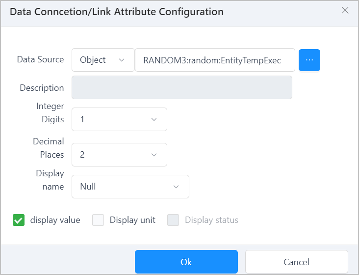
Data Connection
Binds with numeric object property or expressions to display the real-time data of tags. When bound with an object property, you can right-click the element to view the trend chart of tag data in operation center.
Attribute Configuration
- Character: Set the data value style and line height for multiple lines.
- Equipment Vibration Analysis: Enter the link of a third-party device vibration analysis spectrogram, and it will be displayed in operation center when viewing a single point trend from the data link element.
- Fill: Set the pipe color and center color as highlight.
- Label: Set whether to display a label at the upper-right corner of the element, and set the content, content style, background color and border style.
Data Source Configuration
- Double-click the element, and then select an object property or write an expression to be the data source.
- Set the data integer digits and decimal places.
When the set Integer Digits are more than that of the selected data, the data will be compensated with 0. If less, the data will be displayed as it is. For example, the data is 352.69, Integer Digits is set to 5, the data is displayed as 00352.69. If Integer Digits is set to 2, the data is displayed as 352.69.
- Select the display name of the data in operation center.
- Select whether to display data value, unit and tag status in operation center.
Line Segment
Draw line segments on the canvas. You can only draw a horizontal line and turn it around through  on the edge.
- Length: Set the line length.
- Style: Set the line width, typw and arrow direction.
- Label: Set whether to display a label at the upper-right corner of the element, and set the content, content style and background color.